Streamlining Clinical Workflows and Enhancing Patient Care in High-Stress Healthcare Settings
Role:
Product Designer, UX researcher
Timeline
8 weeks
Tools
Figma, Fig jam
Skills
UX Design, UX Research, User Testing
An Overview:
The Problem:
To support emergency medicine physicians who manage multiple patients and critical decisions under pressure, my team remodelled Epic EMR's user experience—focusing on streamlined workflows, intuitive interface design, and rapid information accessibility. As the UX designer, I led user research, created wireframes and interactive prototypes, facilitated iterative user testing with stakeholders, and incorporated their feedback into the final validated design.
Emergency physicians working in fast-paced emergency departments struggle to accurately manage multiple patients' critical medical information during high-pressure situations. Our research highlighted that these high-pressure situations cause heightened cognitive load, frequently resulting in critical errors like missed medication orders, incomplete test requests, and overlooked patient details. These errors not only compromise patient safety but also intensify physicians' personal stress, frustration, and emotional exhaustion during critical moments of patient care.
Discovery:
Design Process:
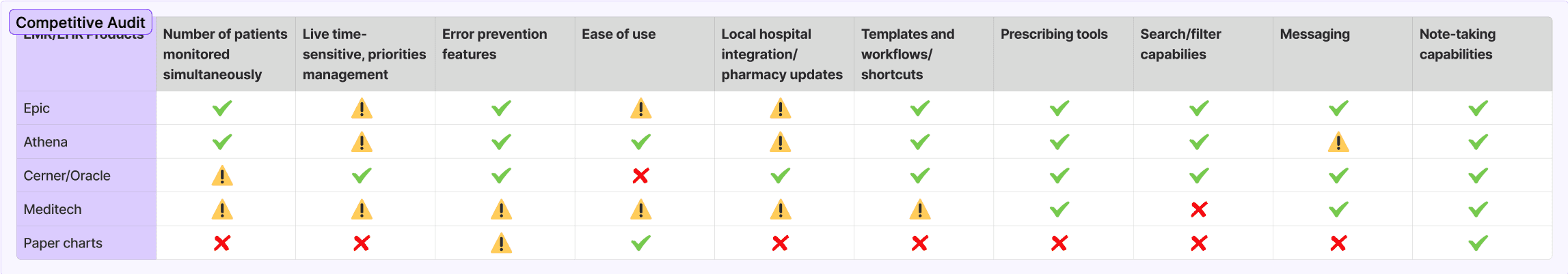
Solution Ideation - User personas, competitive audit, initial problem statement:
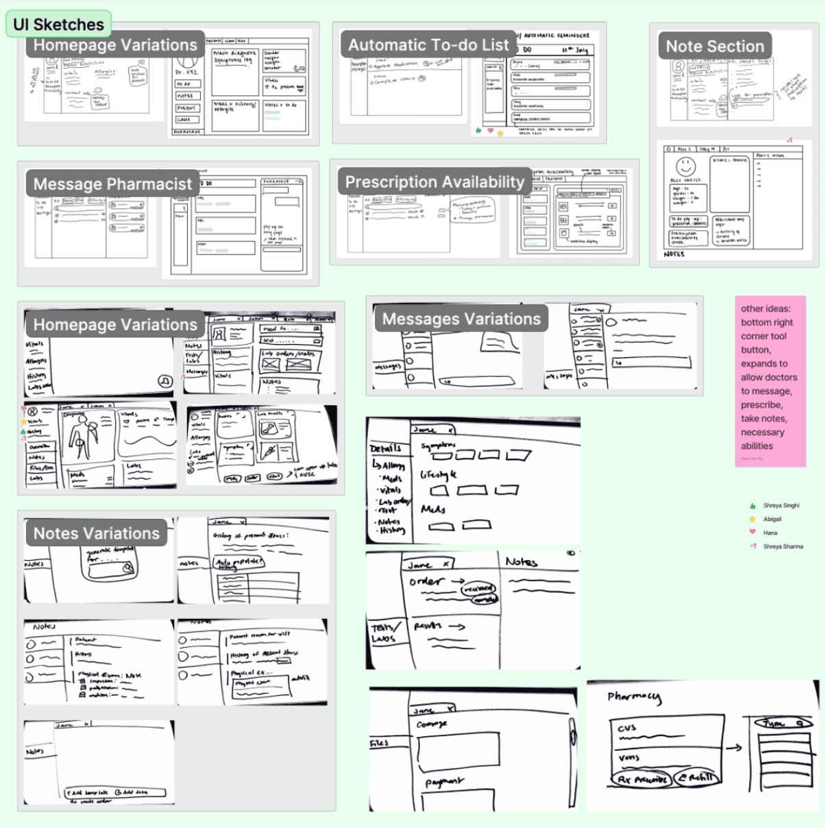
Sketching and Lo-Fidelity Wireframes:
2.a. Sketching and Wireframing:
2.a. Sketching and Wireframing:
we identified two key personas to guide our design process. These personas highlight the need for solutions that address multitasking, task prioritization, and communication challenges, ensuring a seamless workflow for both roles.
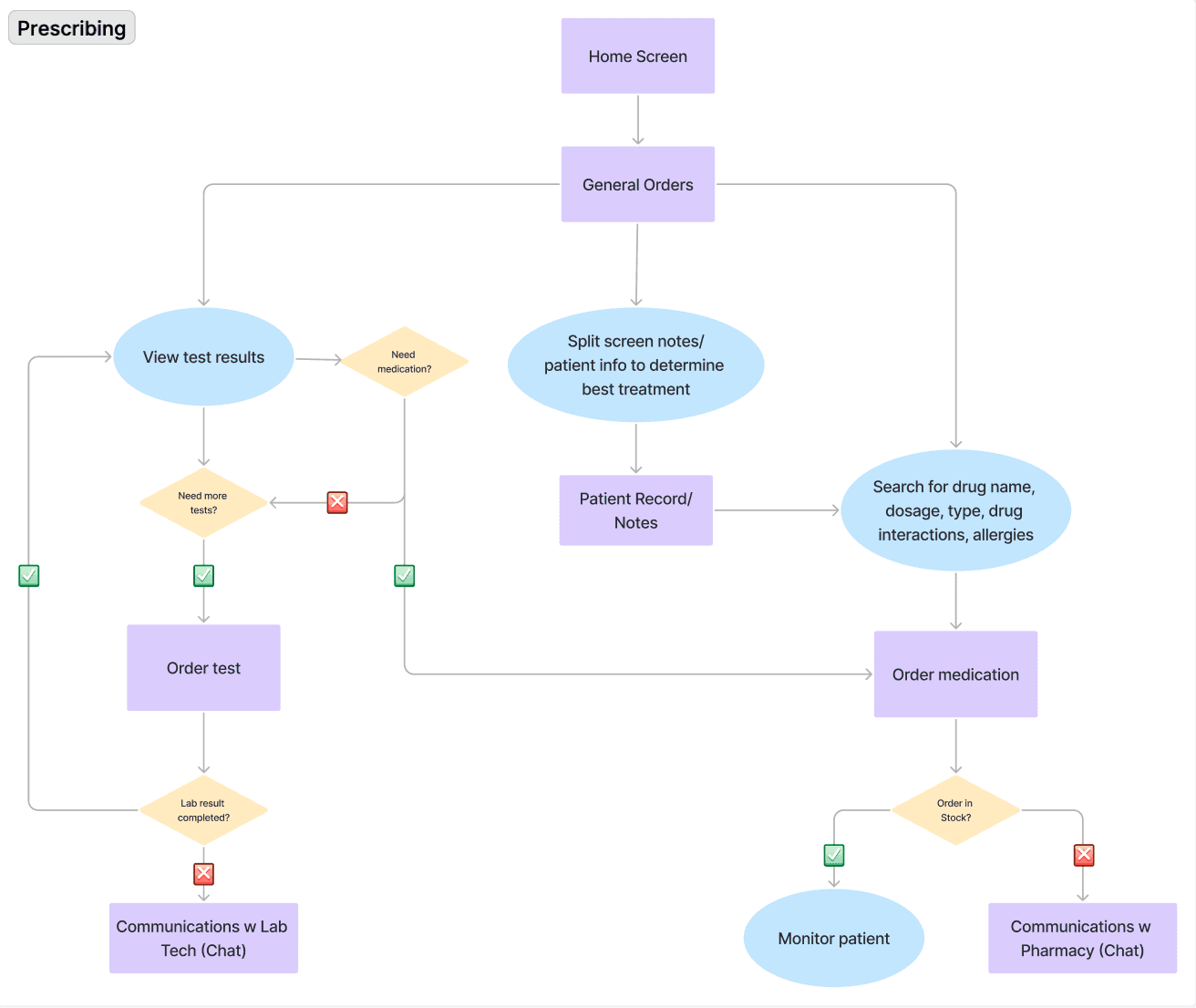
To address the pain points identified in our research, we began by sketching initial concepts for the Dashboard, Notes, and Orders pages. These sketches allowed us to explore different layouts and workflows, focusing on simplifying navigation and improving task efficiency. They served as a foundation for creating low-fidelity wireframes, which we used to test multiple variations of our prototypes.
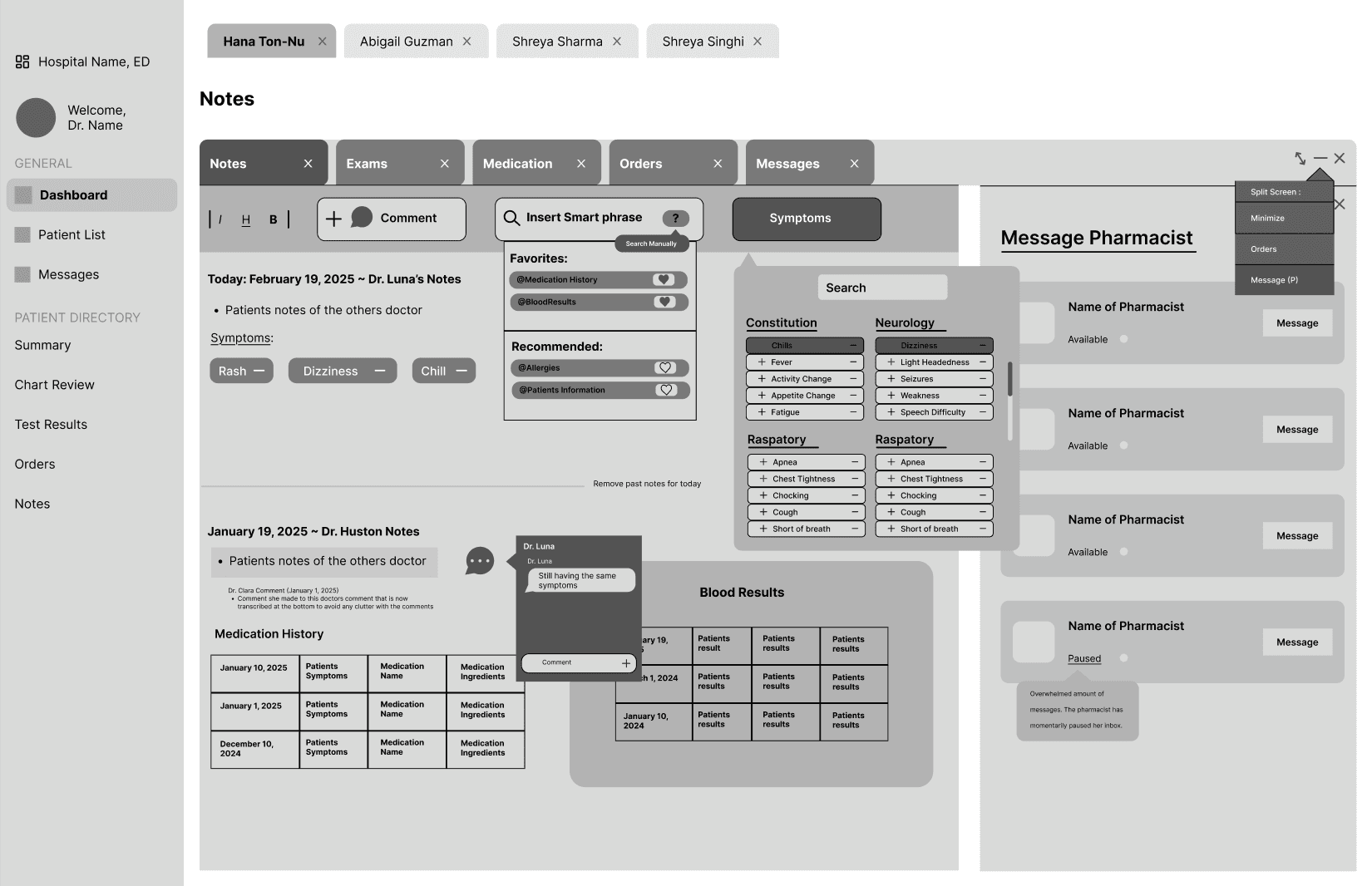
Using the sketches as a guide, we created low-fidelity wireframes to test multiple variations of our prototypes for the Dashboard, Notes, and Orders pages. We evaluated how well each design aligned with user needs and workflows. Feedback from two stakeholders—a 58-year-old emergency physician and a 24-year-old certified nurse assistant—revealed key areas for improvement, particularly around navigation, layout clarity, and feature functionality.
✅Check mark: Interface does have this feature
⚠️Warning icon: Has issues
❌ icon: Doesn’t have this feature


3.a. Branding + Usability Testing:


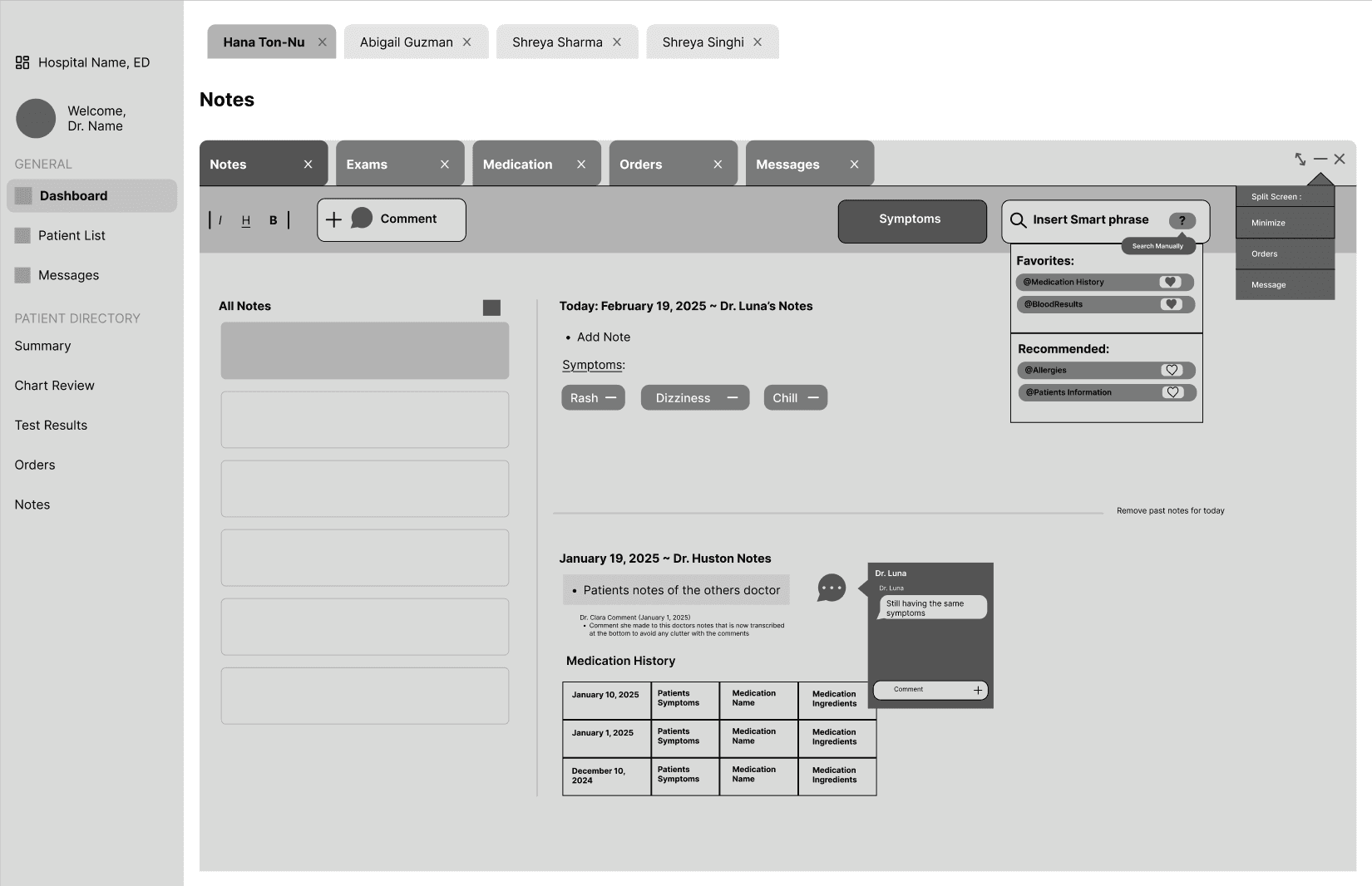
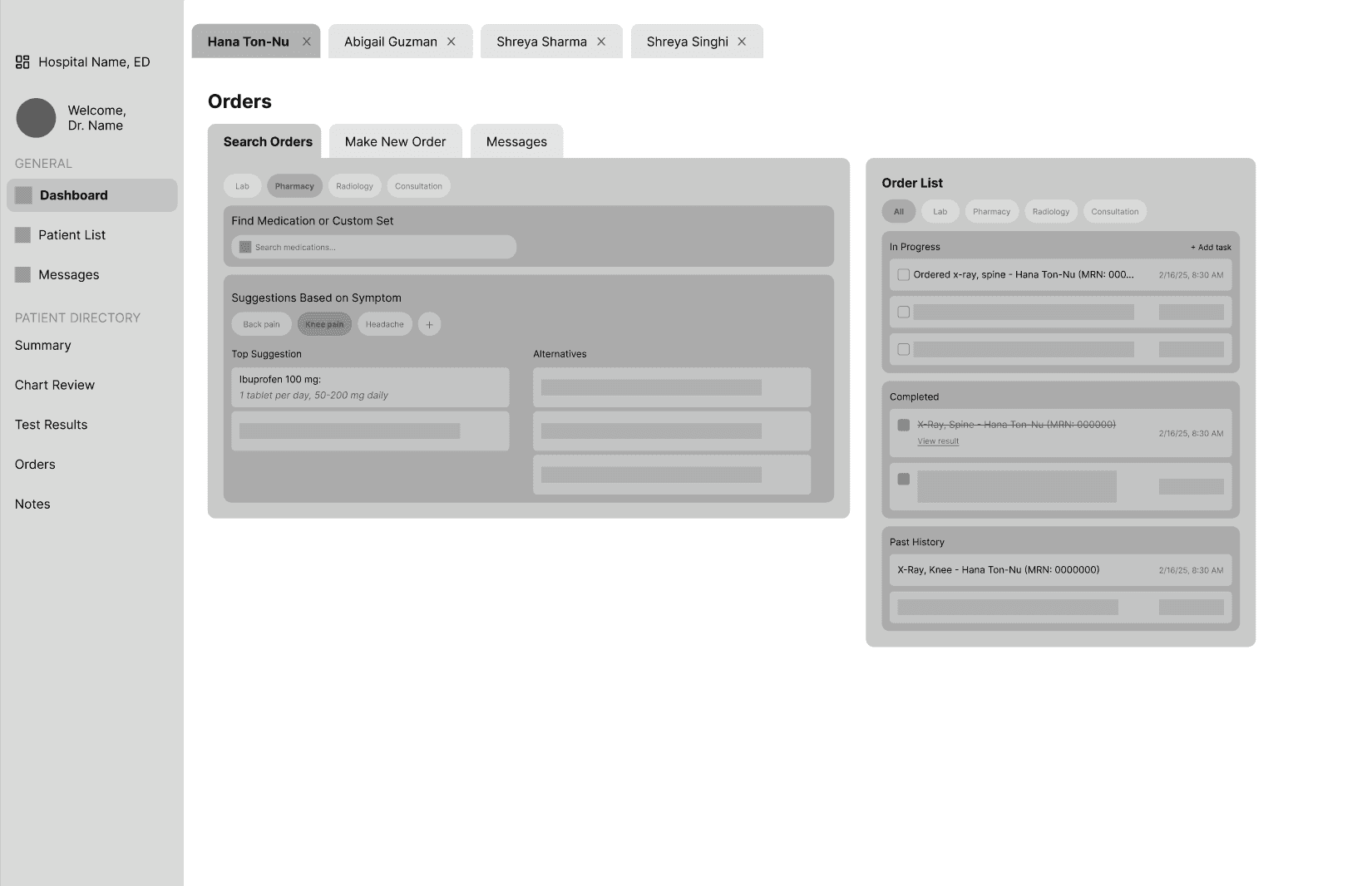
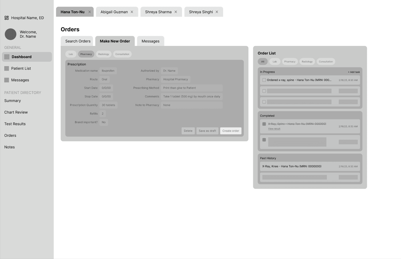
Final Screens:

Reflection:
Working on this case study was an incredibly enriching experience that deepened my understanding of the design process within the healthcare sector. Collaborating with emergency healthcare professionals allowed me to gain valuable insights into their daily challenges and the critical importance of an intuitive user interface. One of the key struggles me and my team faced was balancing a cleaner design with the users' preference for having all relevant information available in one place. Many users expressed a strong familiarity with Epic's current design, which often features densely packed information, making it challenging to simplify and streamline while still meeting their needs.
As we transitioned from low-fidelity sketches to high-fidelity prototypes, the iterative design process became crucial. Each round of user feedback helped us refine our ideas, and it became clear that users valued having comprehensive information readily accessible, even if it meant sacrificing some visual simplicity. This insight reinforced the importance of prioritizing user familiarity and comfort with the existing system, ultimately leading us to incorporate elements that echoed Epic’s design language while still aiming for improvements in usability.
This project emphasized the significance of being open to feedback and adapting our designs based on user needs. It reiterated how successful design is not just about aesthetics; it’s about creating practical solutions that enhance real-world outcomes. Overall, I am excited to carry these lessons into future projects, continually focusing on user-centered design and its potential to improve efficiency and care in the ever-evolving healthcare landscape.
I’m incredibly grateful to my amazing team members (listed below), whose creativity and expertise made this project what it is!
Members: Abigail Guzman, Hana-Ton-Nu, Shreya Sharma


